
Today i am presenting to you the new user interface (U.I.) of MYETV with some new features; the new interface eliminates all the icons at the top left of the page and converges all the functions in the two main menus, furthermore the digital clock has been added at the top left of the page which shows the time and day based on the current timezone (the clock is visible for any app in any platform- [Platform: the set of the main domain and all the subdomain of a particular website; also the computer architecture and equipment using a particular operating system] - ); by clicking on the clock a modal window will show to you your current timezone and a list of clocks with all others timezone of the World. A single dashboard has been added (only for browsers or mobile users), instead of the many icons, with many new unified features that change depending on whether you are logged into the platform or not.
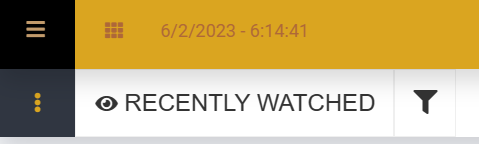
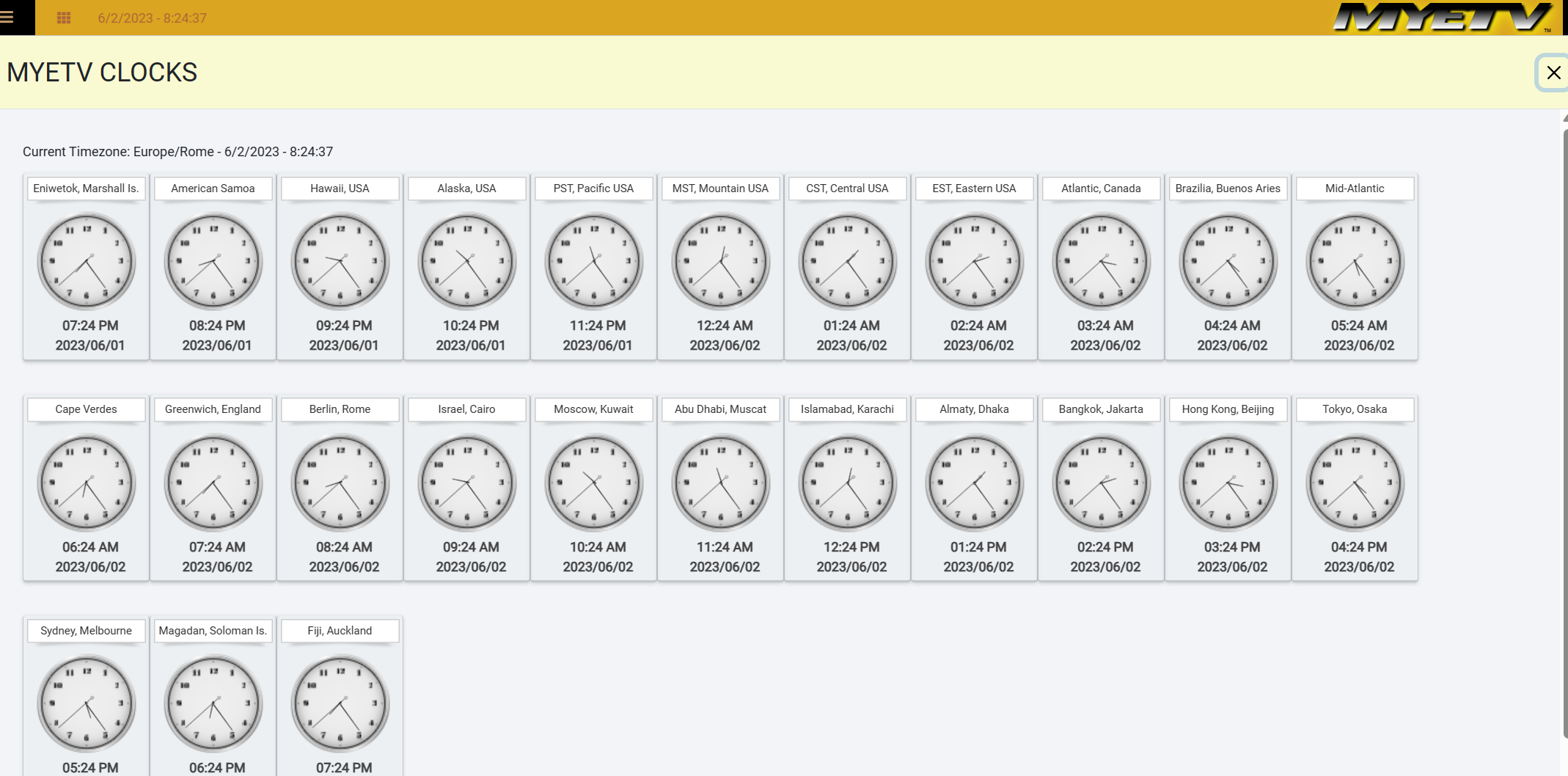
In the image above we find an example of user-interface and digital clock which is positioned at the top left of the screen; when you click on the clock, the modal window that will appear will be similar to the following image including analog clocks.
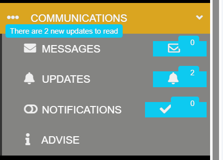
In addition, the notification icons (notifications, updates, private messages) have disappeared from the top of the page and they are inside the main menu on the left.

As a logged in user the open menu looks like this
These changes ensure that the features can be used on any platform and with any application (even those for mobile and/or for widescreen or TV). In addition to all this, the design of some parts of the platform has also changed, for example the checkbox from this:
![]()
![]()
to this:


Starting today, this design will be official for all MYETV pages.
Please note:
all the images are for demonstrative purposes and may change in the future and the images published here may not represent the updated images.
